Color week 20 bring us to Potter’s Pink. It is an unloved watercolor based on reactions from some of my instructors. I was 1st introduced to Potter’s Pink as a recommended colour for a class and the instructor never used it, then in another class an instructor saw Potter’s Pink on my palatte and said ‘get rid of that’ and recently an instructor said it was too dull.
So I have decided to research the history and find a watercolor artist who uses Potter’s Pink.
Potter’s pink was invented by an unknown Staffordshire potter in about 1780. Winsor and Newton introduced it as a watercolour in the 19th century
Natural pigments.com
For years I’ve called Potter’s Pink my secret weapon
Liz Steel obsessive sketcher
Potter’s pink is naughty in mixes
Unidentified blog comment
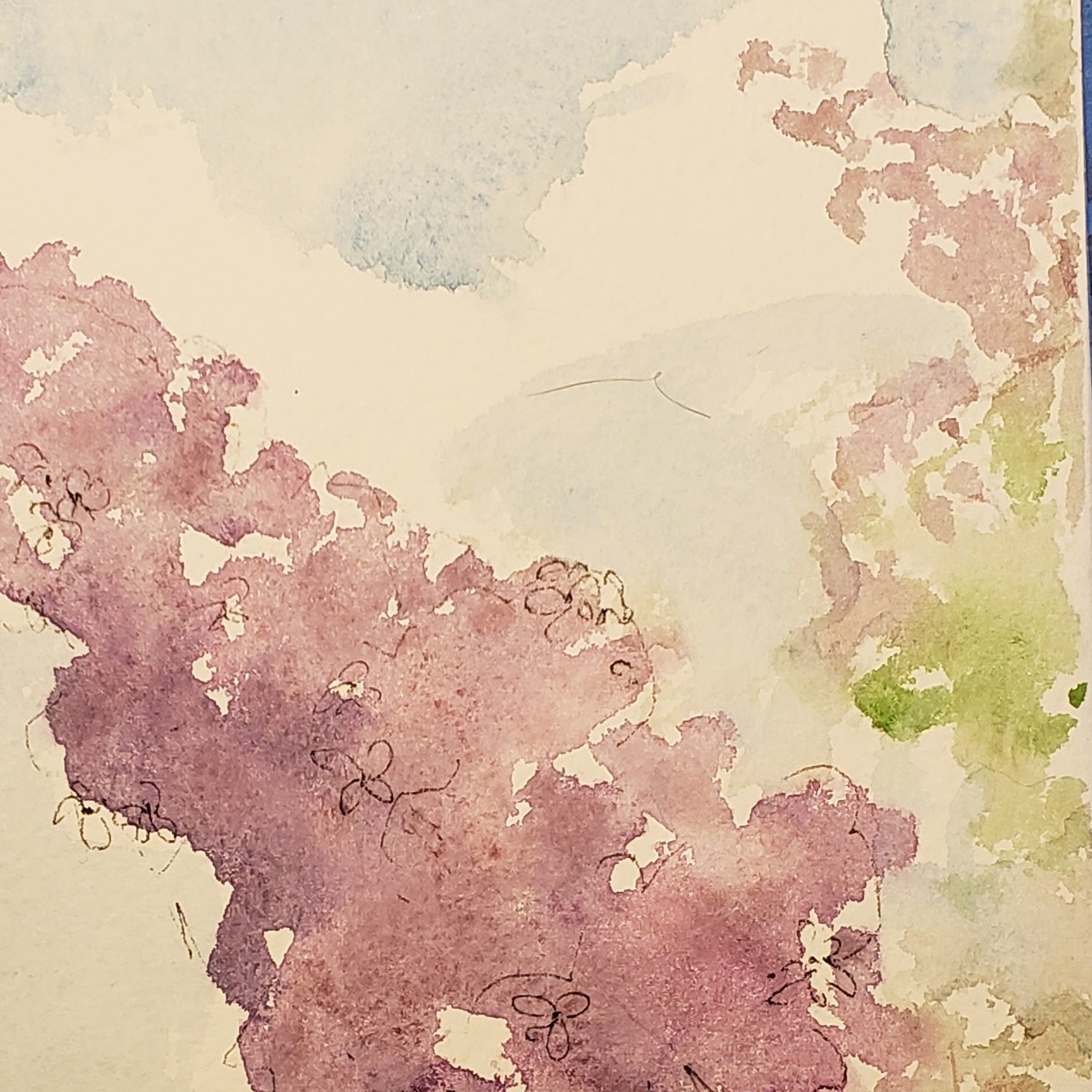
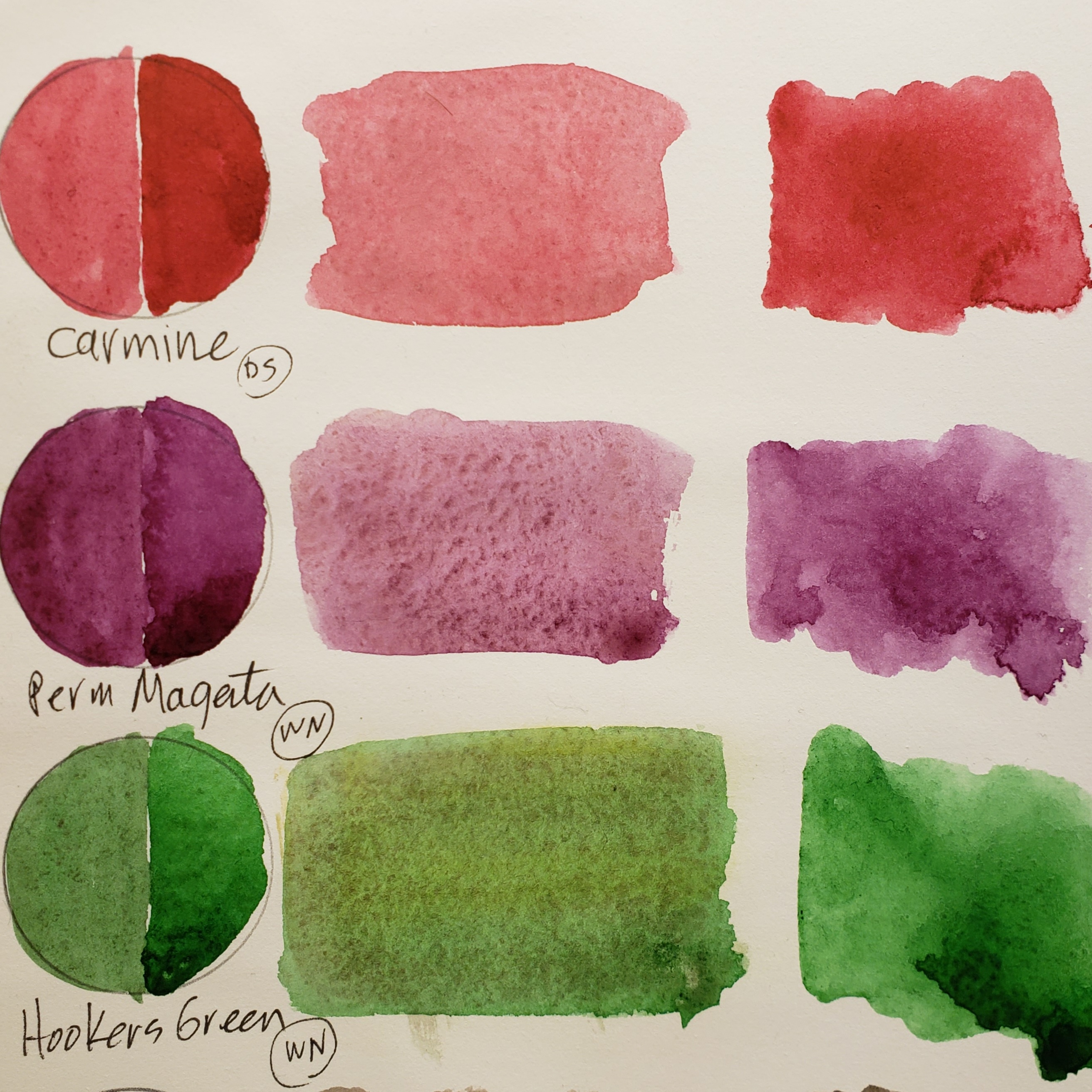

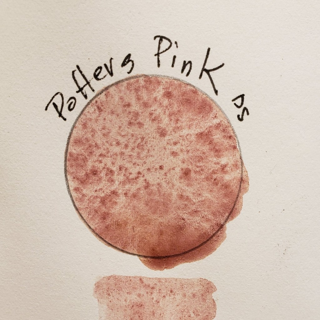
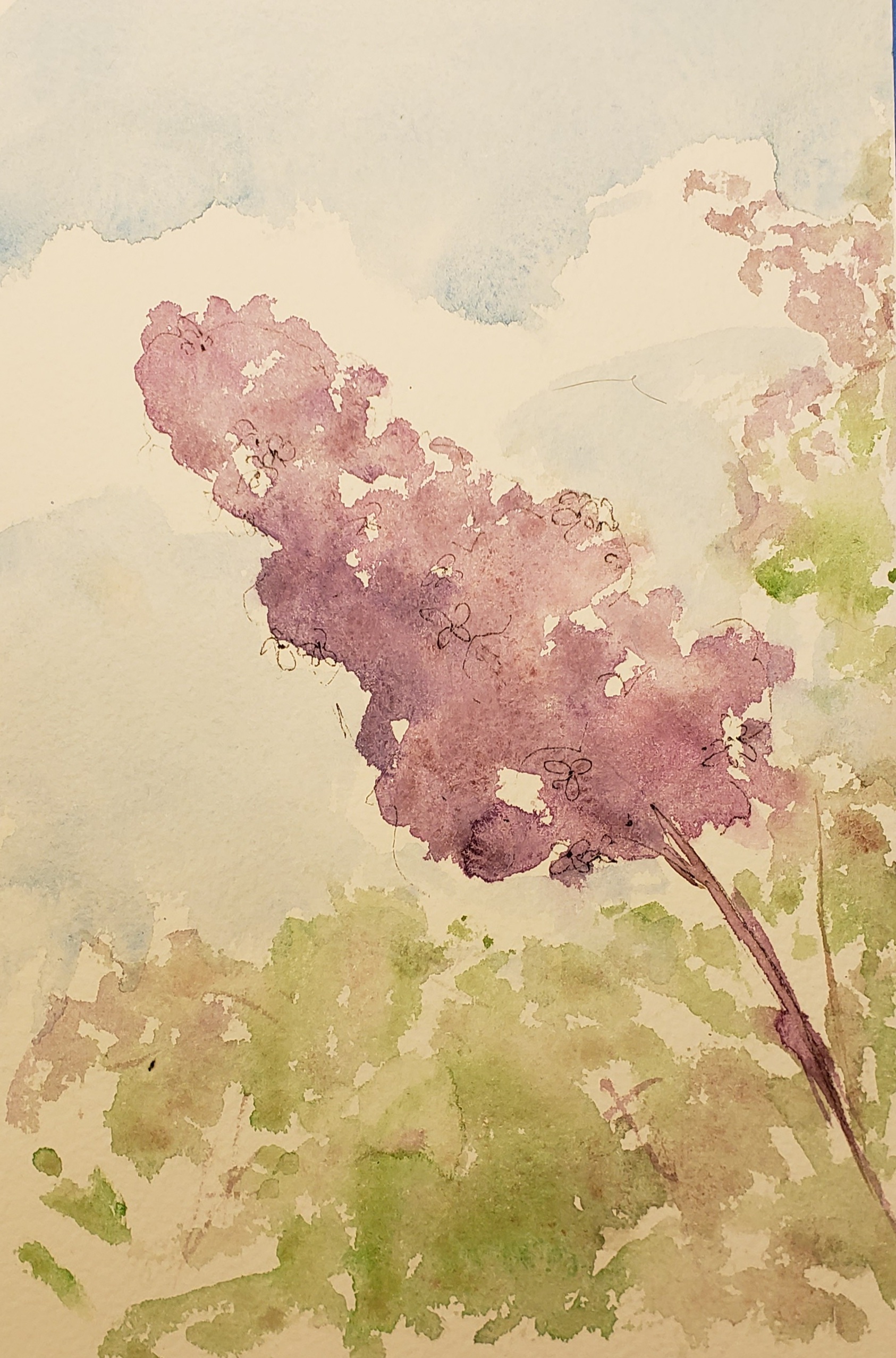
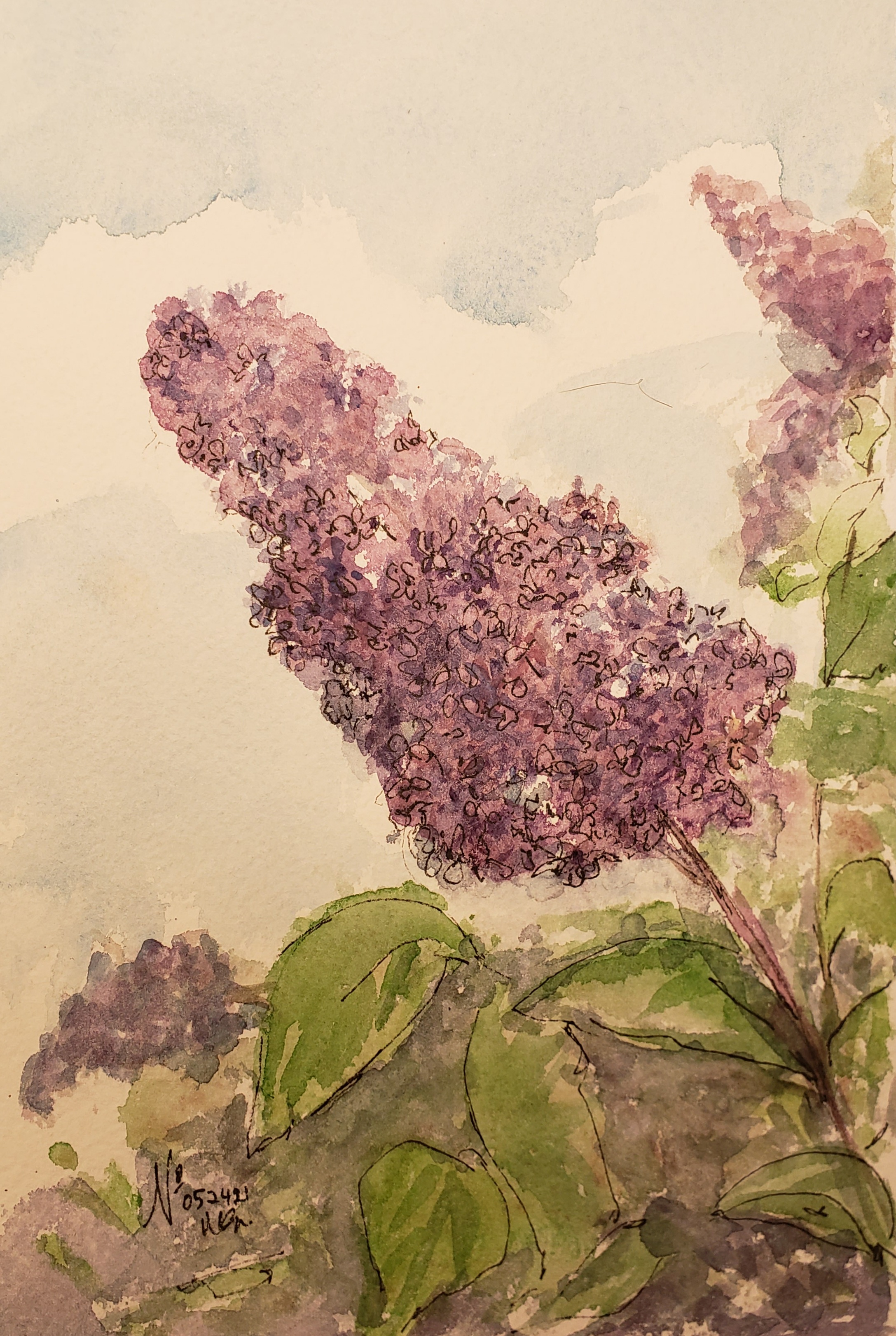
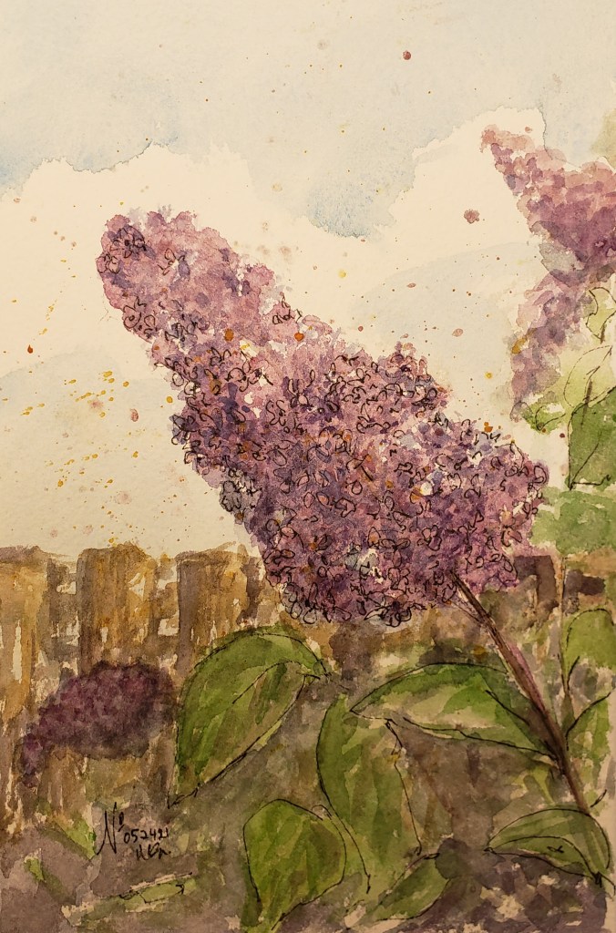
I started my own investigation with Potter’s Pink [PP] this week and although I have used it some in the past I have never really experimented with the colour. PP is granulating, VERY granulating. PP is a neutral it is not warm it is not cool in tone. PP has a vintage (dull!) quality. When mixed with other colors PP creates a granular wash that might work nicely when capturing the color variations in sand, soil and rocks. Using PP as the initial wash and adding pigments works nicely. I especially like it for clouds and earth tones. The swatches and lilac sketch demonstrate the qualities of PP. It will STAY in my palette

Leave a comment