One of the tasks in a watercolor class assignment this week includes selecting a ‘color scheme’. It seems like a simple task – thus the topic of Color Week 29.
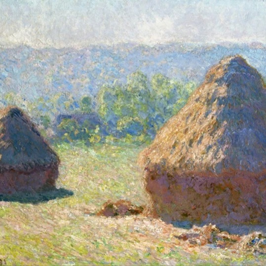
Monet loved to use a limited palette. He achieved more luminescence by having to utilize more mixes rather than from a variety of colours. Typically he used just three colours, a warm and cool of each
These choices might replicate a warm/cool limited palette of Monet:
- Lemon Yellow – Cool
- New Gamboge – Warm
- Pyrrol Scarlet – Warm
- Alizarin Permanent – Cool
- Ultramarine Blue – Warm
- Cerulean Blue – Cool
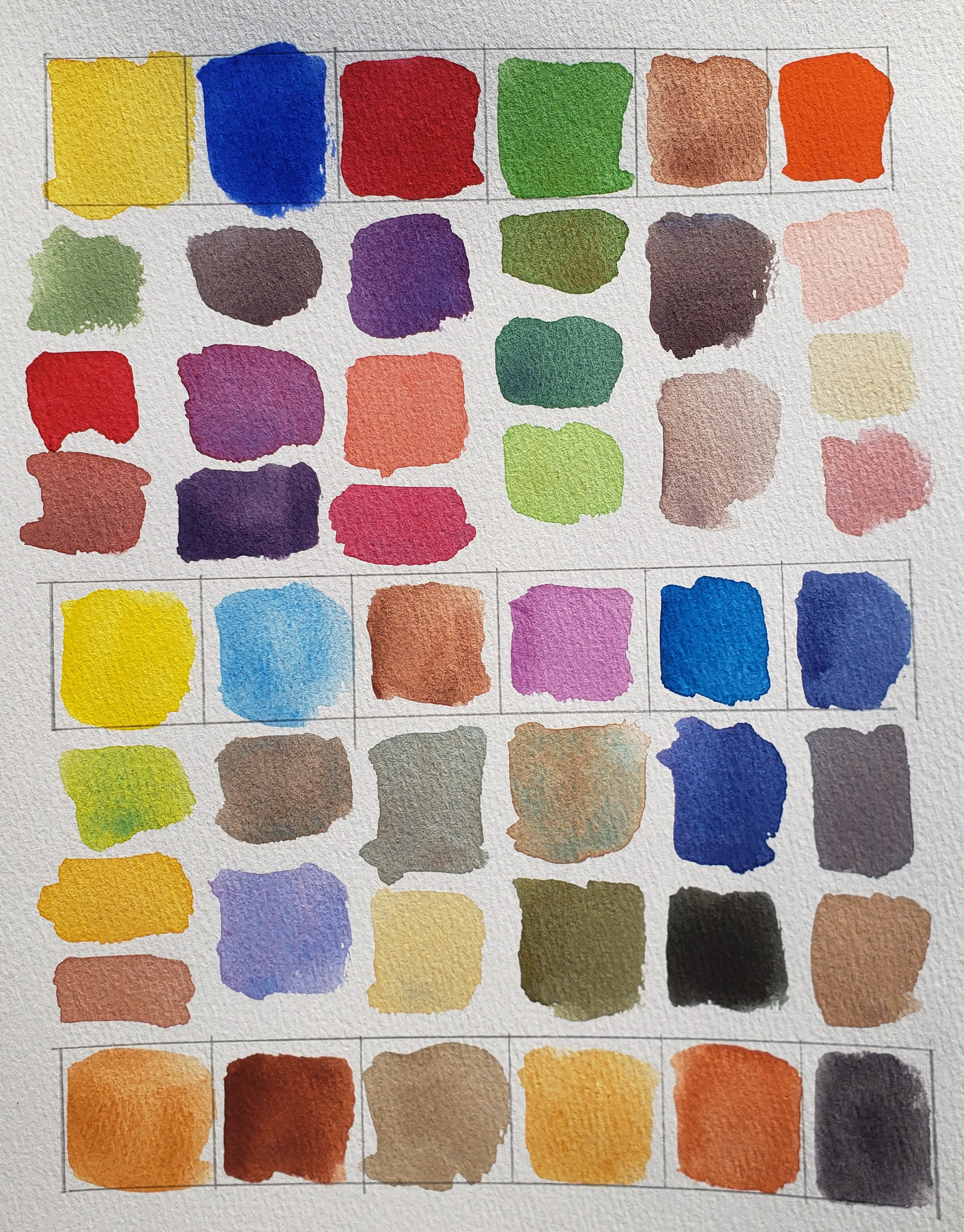
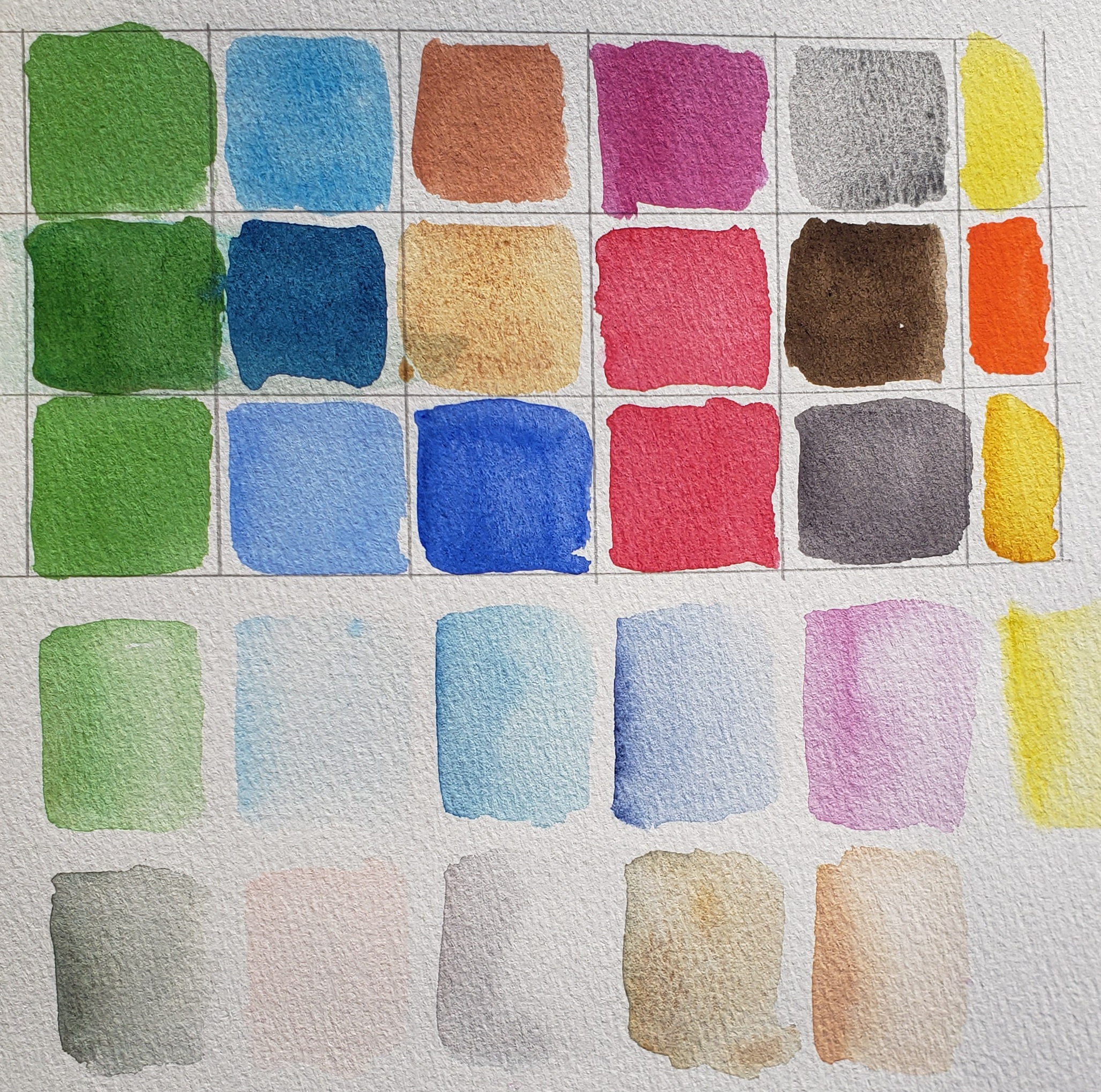
Back to choosing a color scheme – there are so so many enticing watercolors for the palette. Winsor Newton offers 108, Daniel Smith 261 and it’s fun to select new colors for the palette, but a color scheme is limited!
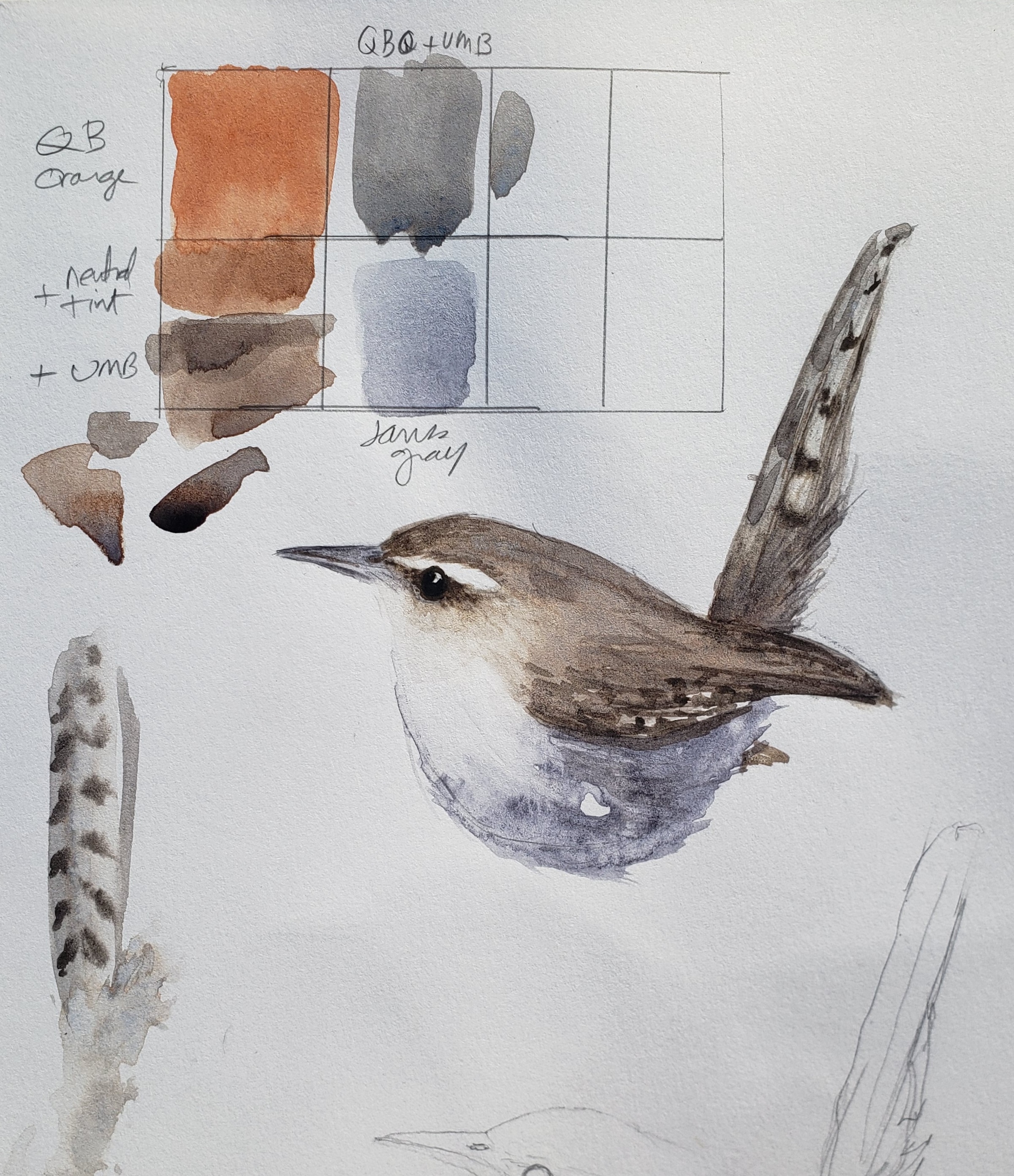
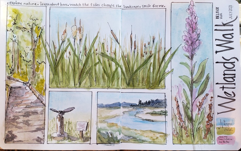
Below are some examples of color schemes shown in sketches from classes I have taken over the past few years. Every instructor has a suggested palette with a limited selection of warm & cool colors, plus what I would call their ‘signature, go-to’ colors. From Stephanie Bower we learned to use Sap Green and Pyrrol Orange, Shari Blaukopf introduced me to Indanthrone Blue & Phthalo Green and Ian de Hoog’s birds eyes are enhanced by his very specific choices.

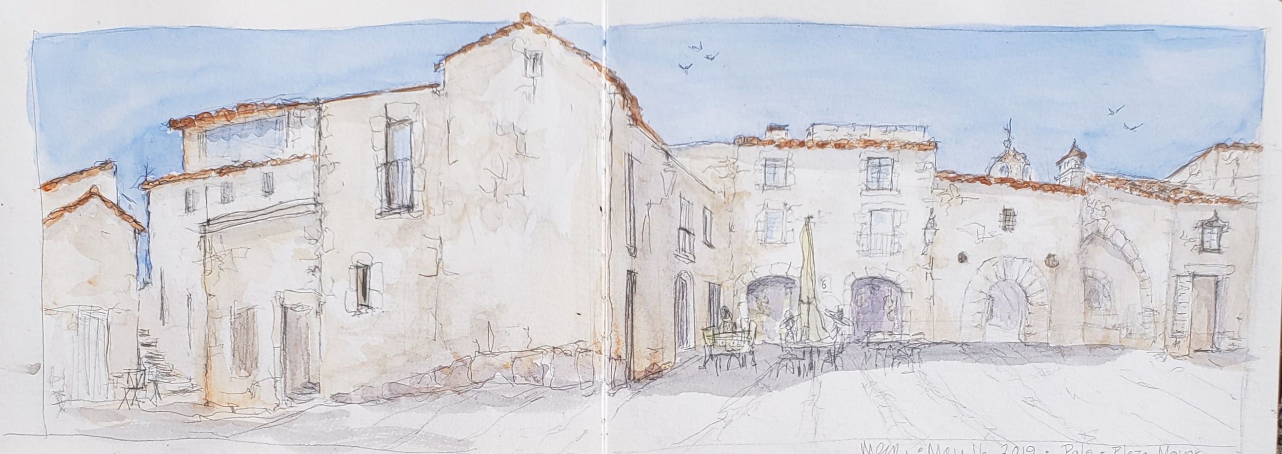
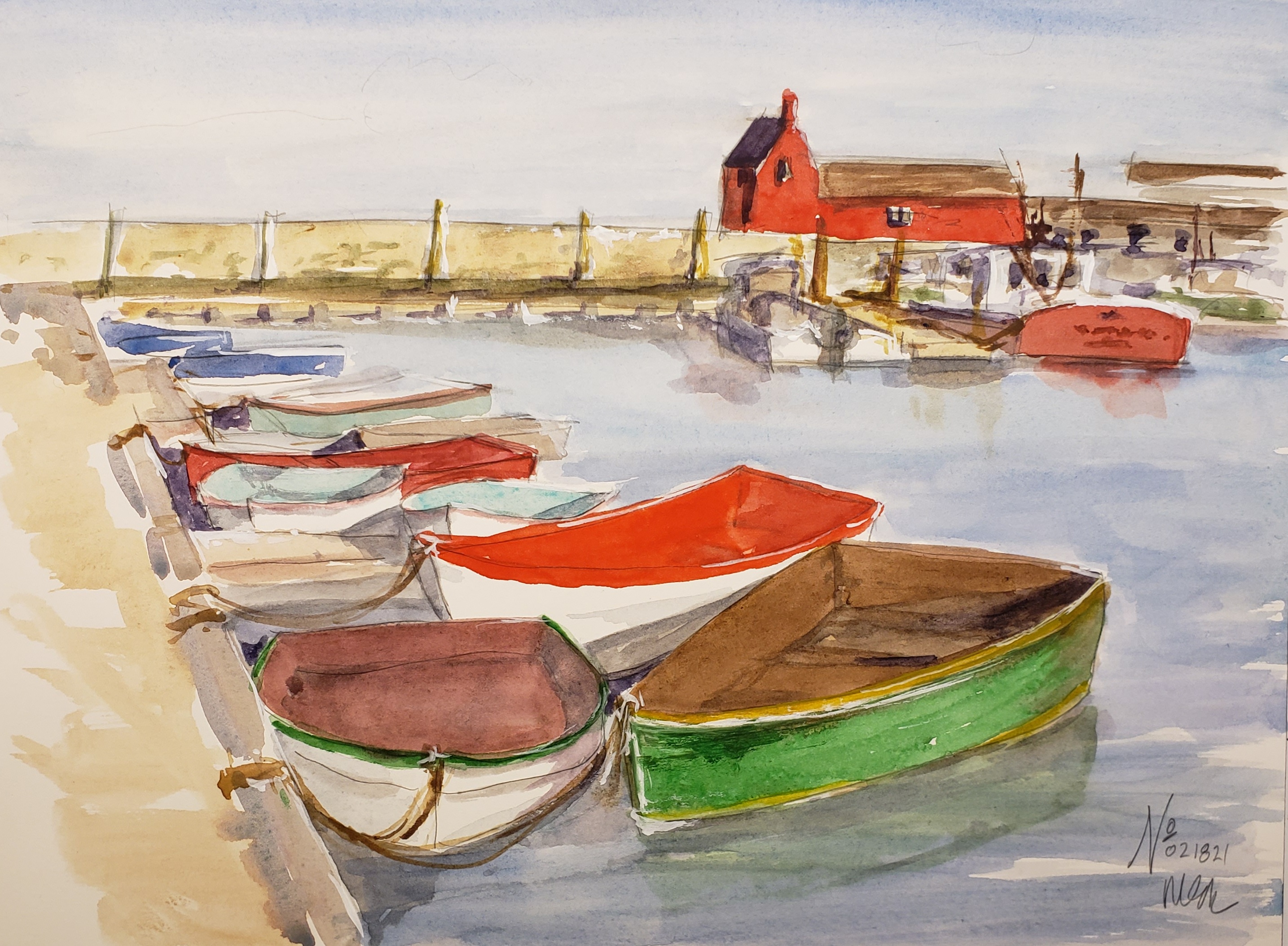

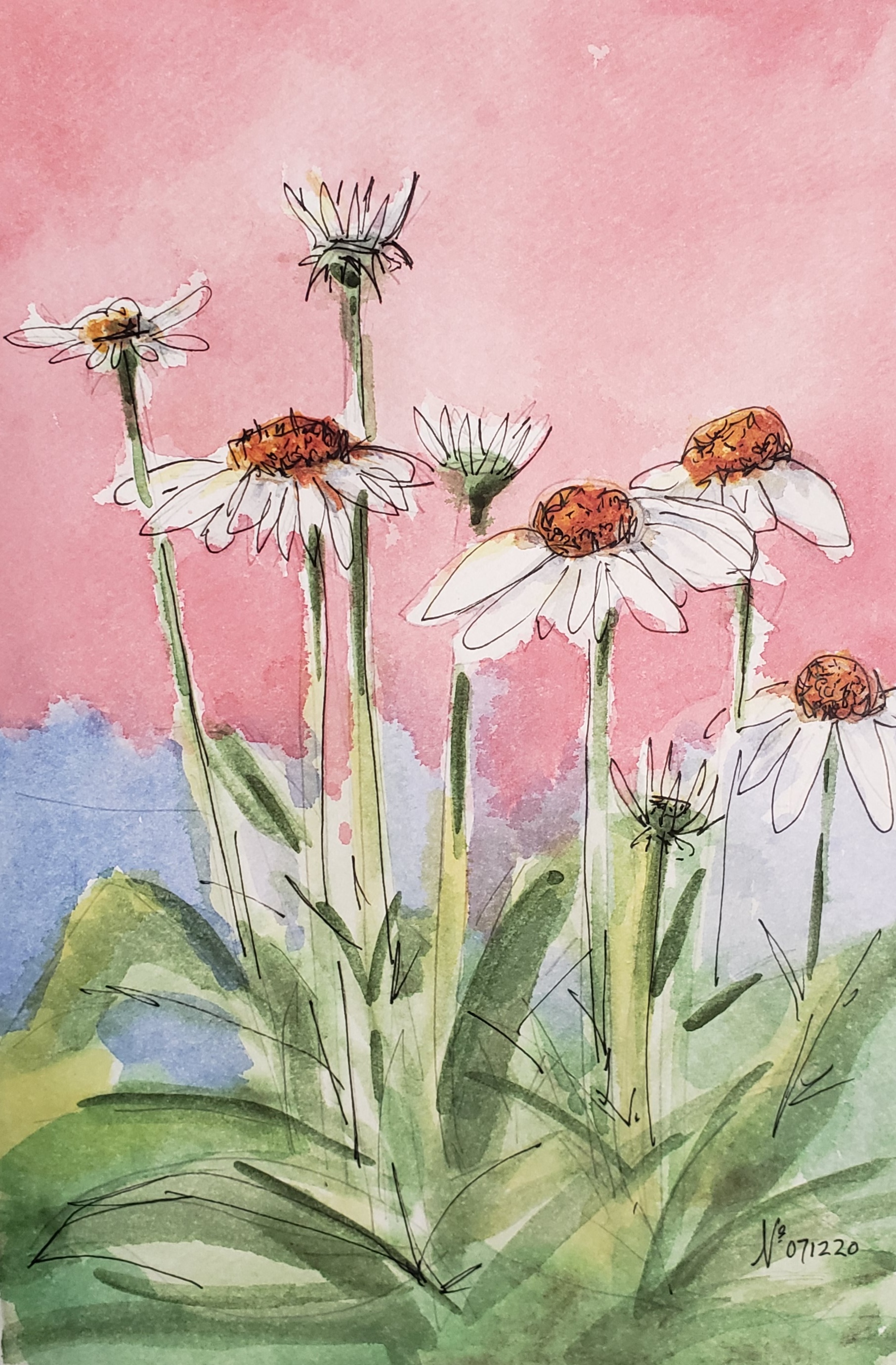
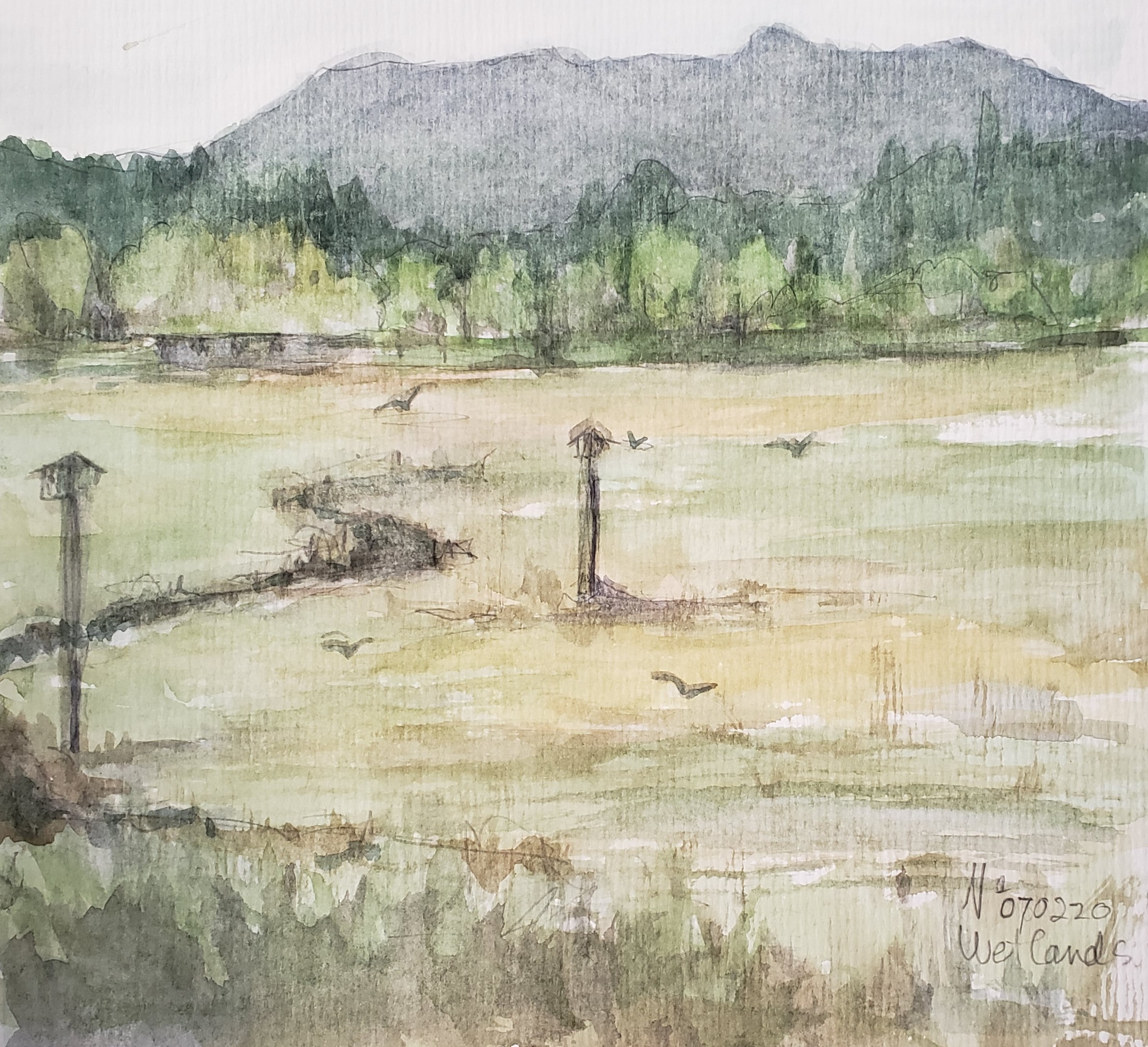
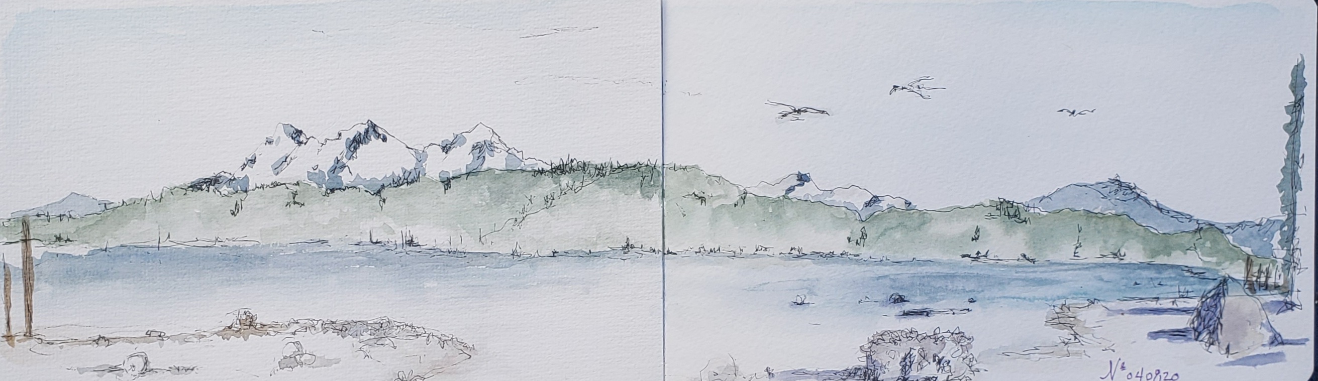
Here are some of my color scheme choices when plein air sketching… out on my own!
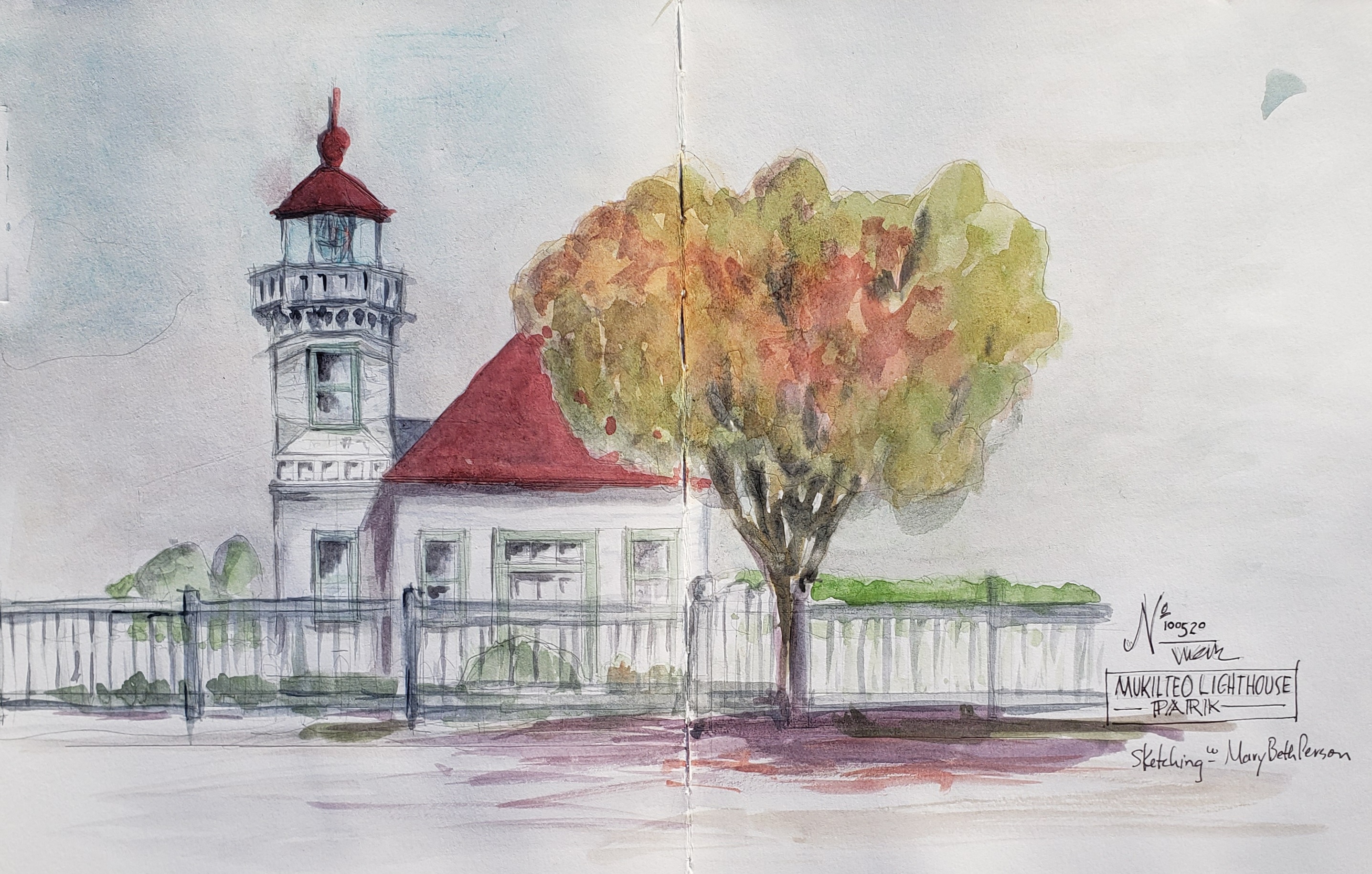
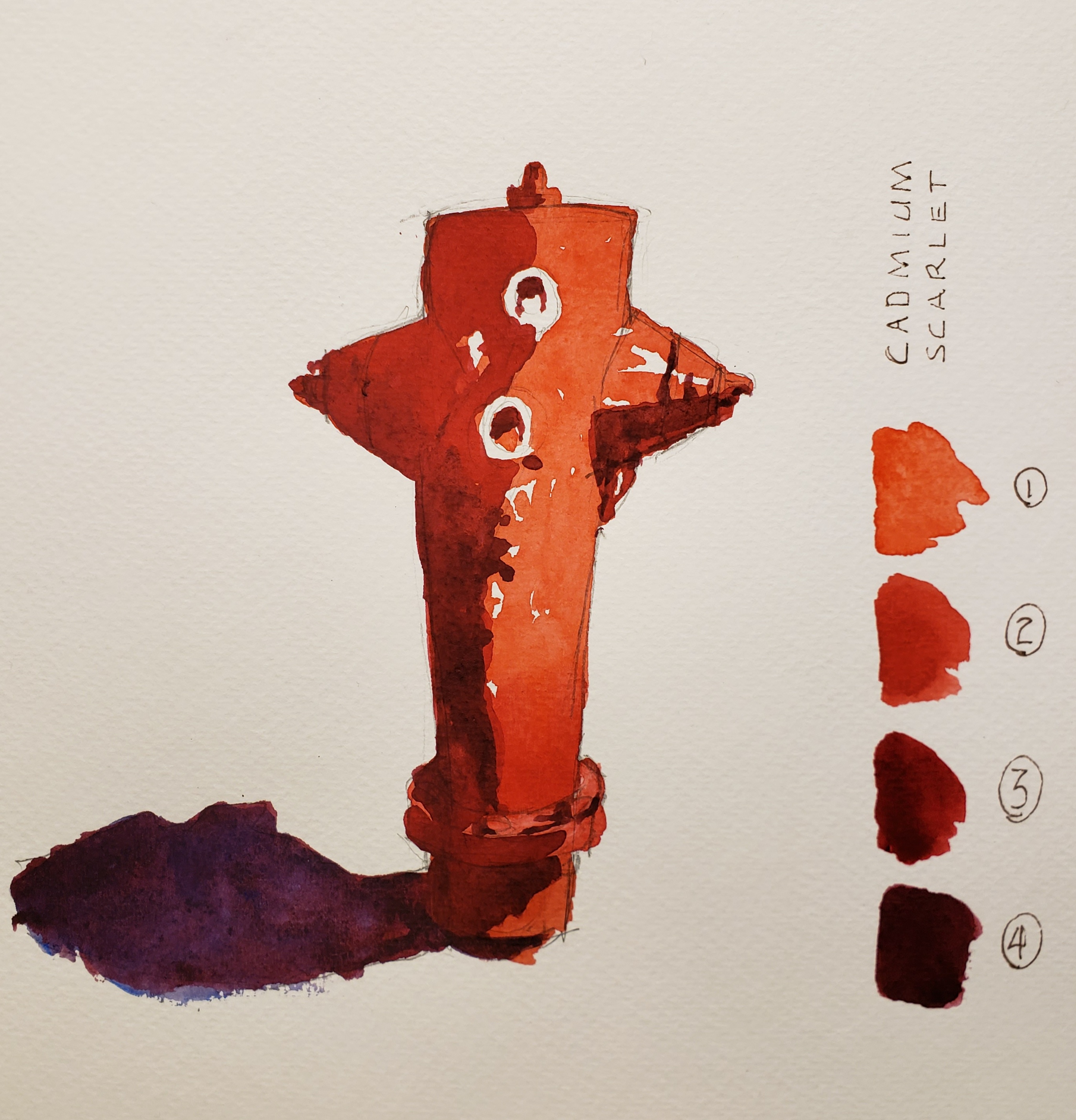
And my class work this week:
In January 2021 I started ‘Color Week’, a personal goal to weekly explore a color history or curiosity.

Leave a comment