Adding words to a sketch is a good practice to understand so Jean Mackay provided us with a few tips for hand-lettering during the Nature Sketching workshop in Italy. I am not much for adding phrases into my work but some simple steps for making lettering look polished were welcome. We spent about 20 minutes on these few techniques that I can & will remember and use!
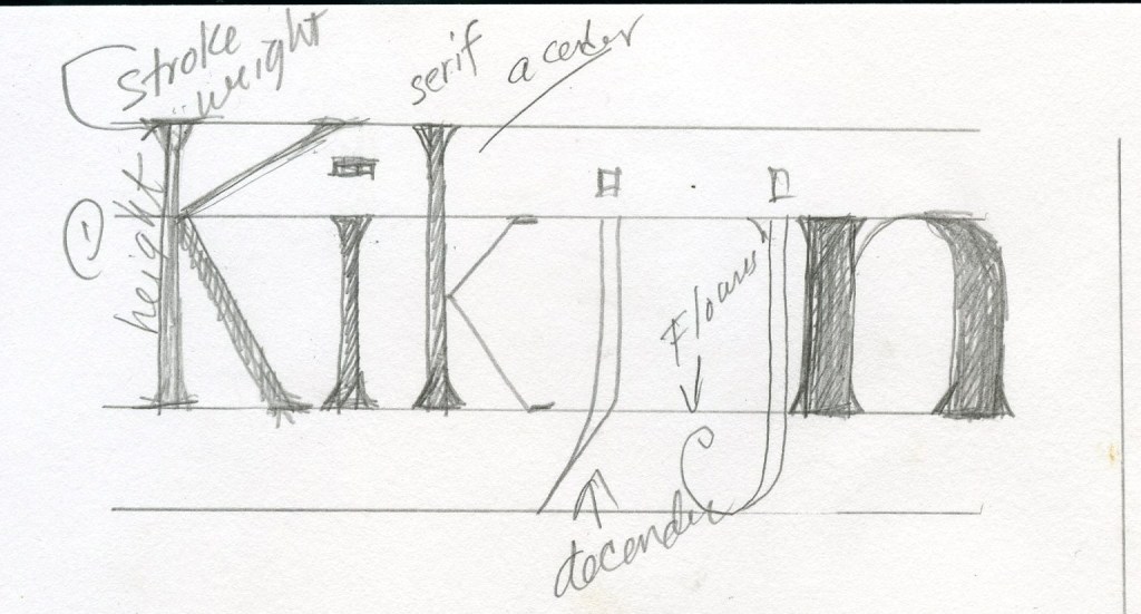
- Use guidelines, especially if you are new to lettering. Make the lines with pencil & use a straight edge. Plot the height and volume.
- Create letter vertical lines that are parallel. Keep the letter horizontal connectors at relatively the same level. Be Consistent!
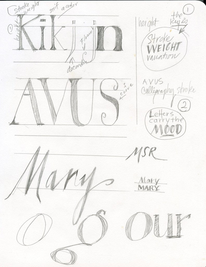
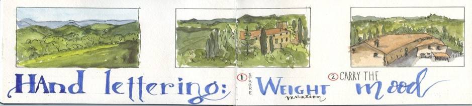
- Add some ‘Stroke Weight Variation’, this is ‘Key’ to an interesting lettering style…and so worth the effort. [look around for a lettering type you like and copy the strokes]
- Practice & Repeat. Perfection is Not required.
- Let the ‘Letters Carry The Mood’ of the message – stiff letters, flourishes, calligraphy each has a mood/message.
- Let your own personal style show.
When placing a quote into a sketch use tracing paper to position the words in the composition… you will know exactly how the final will fit and look.
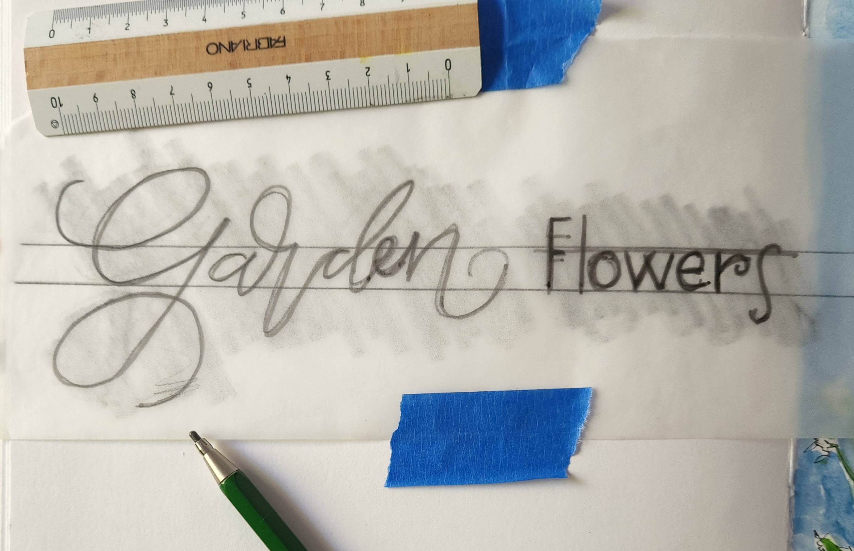
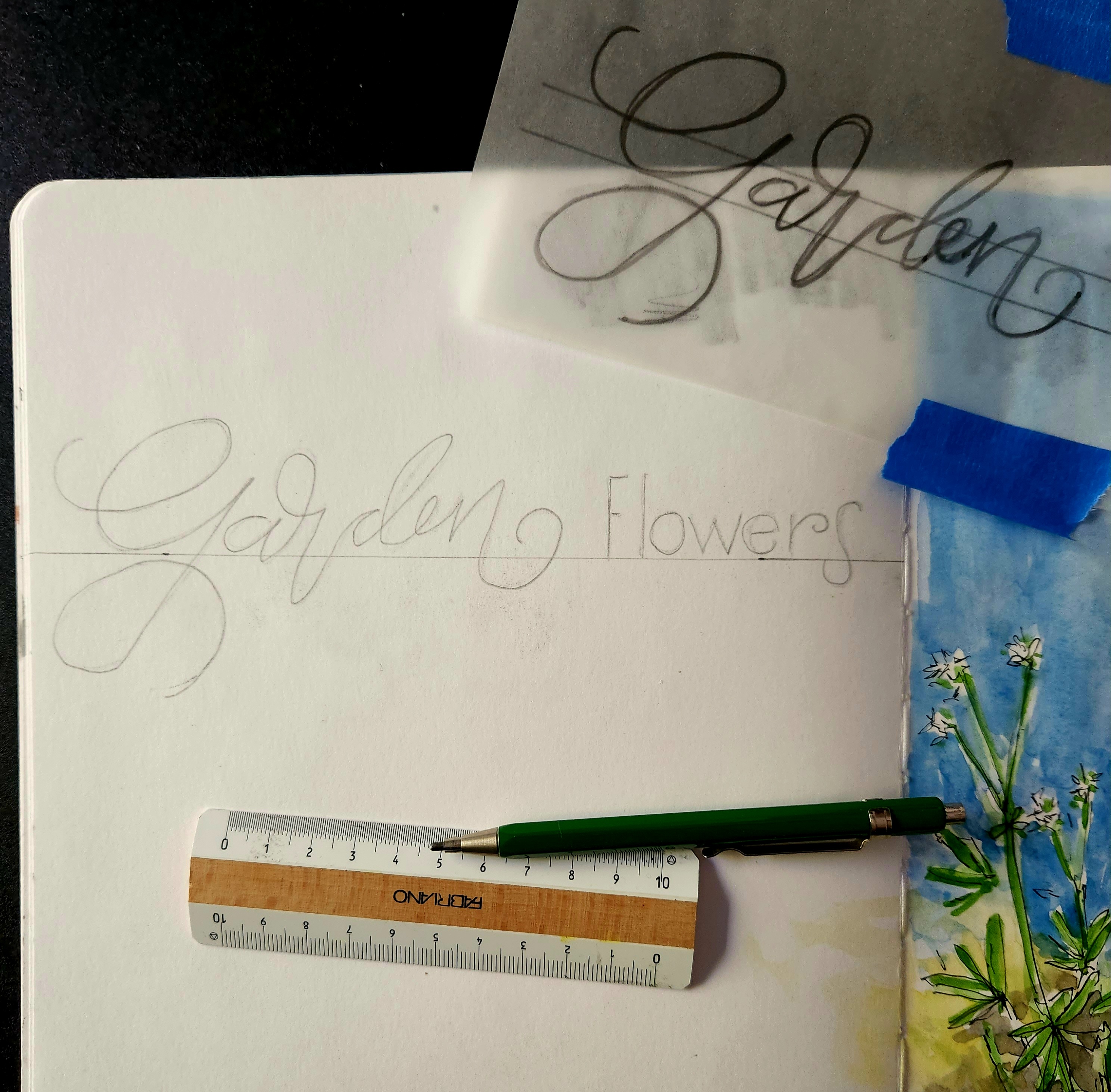
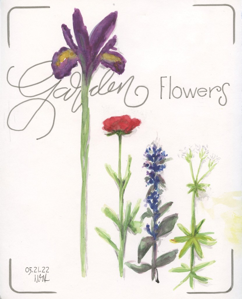
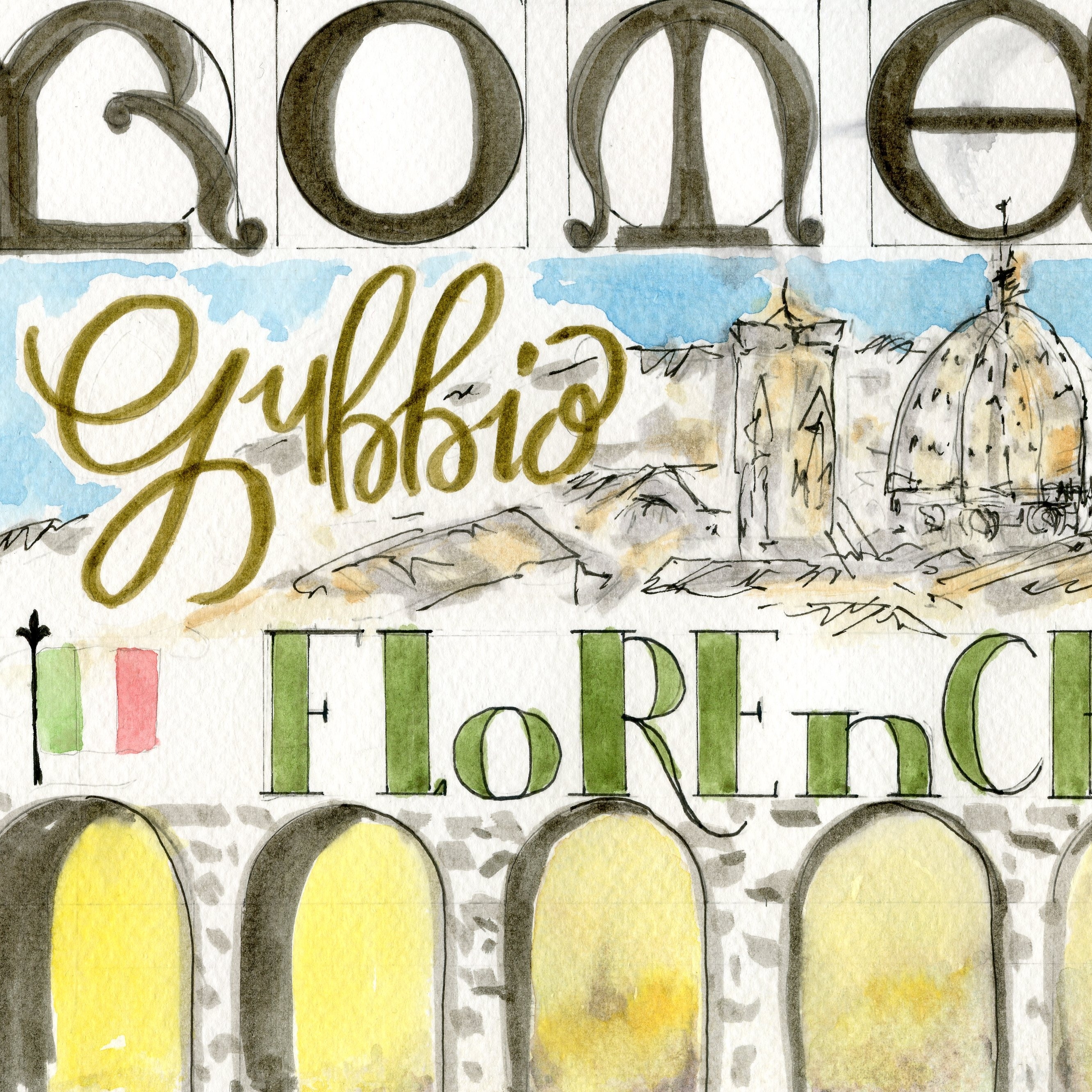
Here are a few examples of recent lettering in my sketchbooks – taking time to create pencil lines, planning the size using tracing paper, inking or painting the final letters and erasing the pencil lines.
Remember this one!

Leave a comment