
If you pause and look around the environment where you are right now, do you see much Orange? Orange, our color this week does not casually creep into our personal environment… possibly if we are outdoors in the fall foliage, or maybe if we work in an industrial site surrounded by safety messaging or drive cross the Golden Gate Bridge.
Until the 16th century orange was referred to as yellow red. It was the 19th century Impressionist’s extensive use of orange, especially as a contrast to blue, that gave the movement its name and notoriety to the color. For most in the 19th century orange was considered ‘too brilliant’, but then in the 20th century with use as a marketing tool and for visibility, orange became a success.
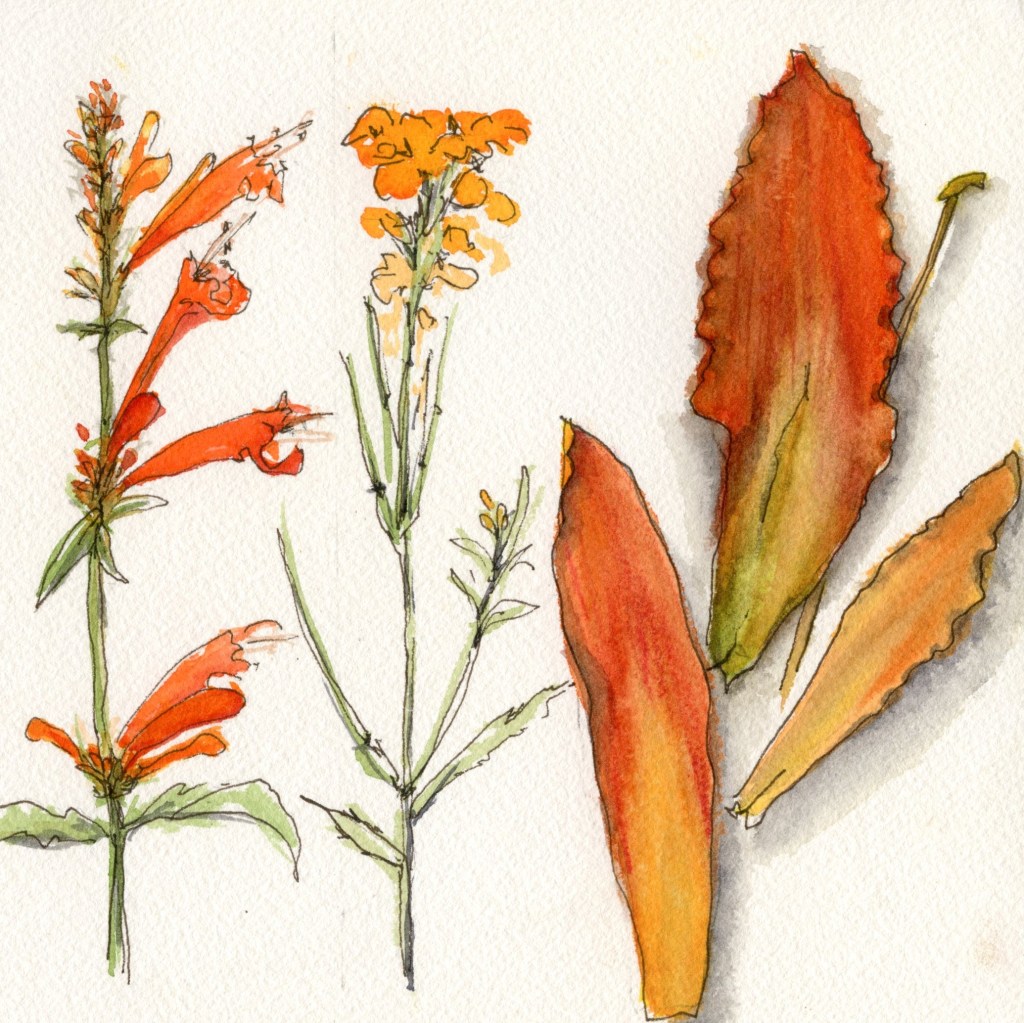
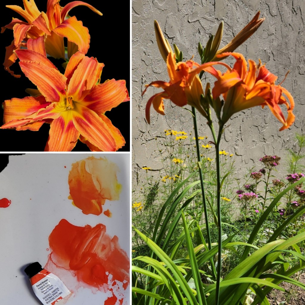
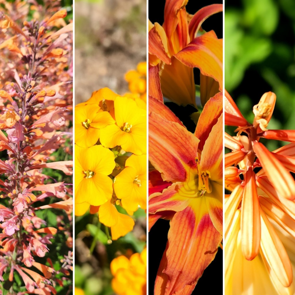
This week, in my garden the orange plants are blooming brilliantly in the sun.
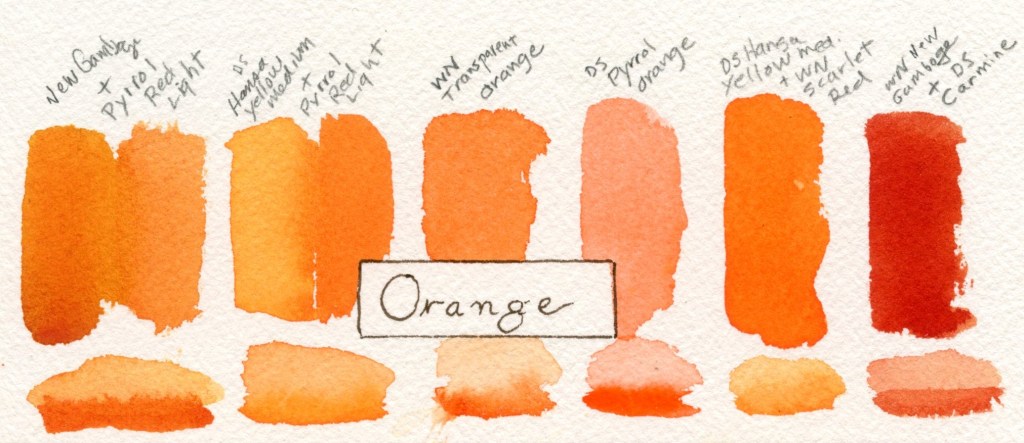
- Orange on my palette
- Pyrrol Orange
- Transparent Orange
- For mixing Orange
- 2 Yellows: Hansa Yellow Medium, New Gamboge
- 2 Reds: Scarlet Red, Carmine
While doing my orange research I referred to the book Colour by Victoria Finlay. Finlay is an excellent researcher and informative writer with interesting storytelling, I recommend her books.
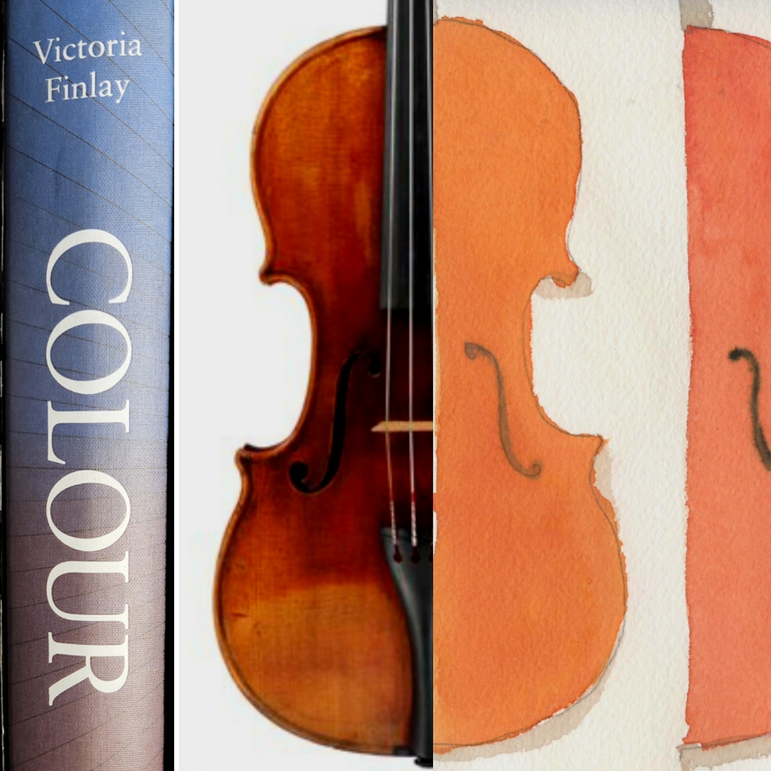
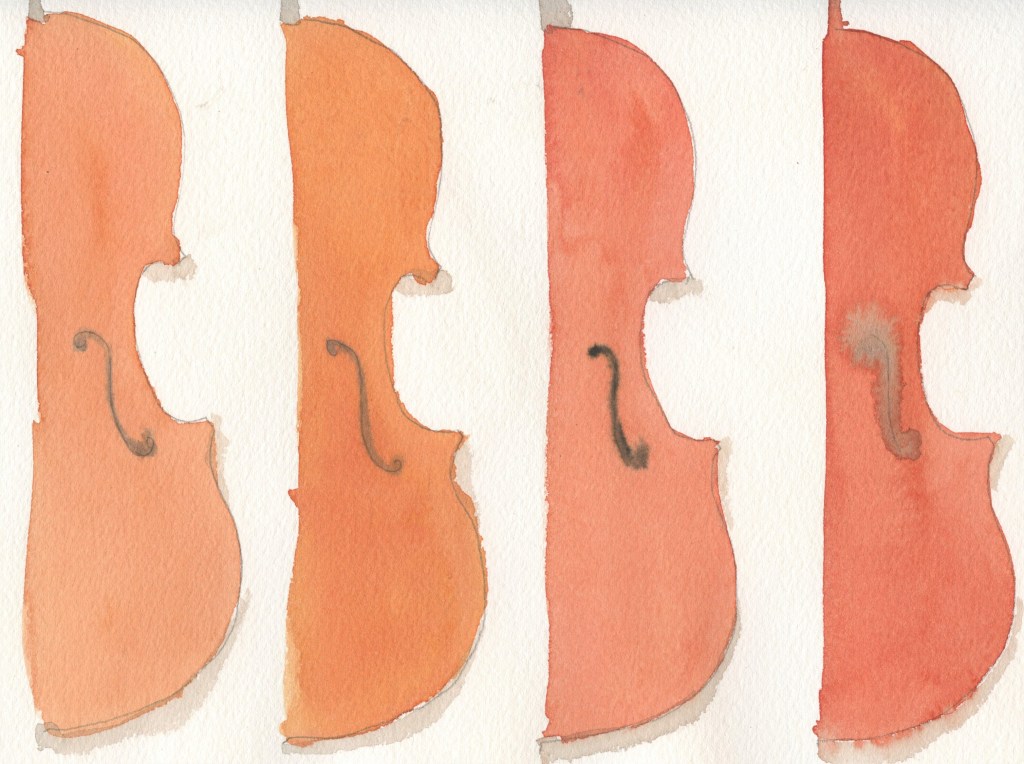
In the chapter on Orange, Finlay dives into the mysterious ‘orange varnish’ of the Stradivarius violin. It’s a fascinating story and in the end of course the mystery still survives. I think one of the best summaries of how Stradivarius obtained his color is that he was an ‘artist’. Based on scientific analysis there are red pigments in the varnish, including materials easily obtained and broadly used in his time.
… he was simply a true master of his craft including color.
Jean Philippe Echard, The Nature of the Extraordinary Finish of Stradivari’s Instruments
In summary: Use of orange has an ancient history although we did not get around to giving it an English name until orange trees arrived in Europe from Asia. The fruit name is used to name the color across many different languages and the too brilliant color carries much symbolism in many religions and cultures.

Leave a comment