Color on maps has history ranging from aesthetic to symbolic, from decorative to the complex color theorems started in the 1800s to distinguish countries, states and bodies of water.
In the 19th century before complexity set in and before maps were printed with color it was a popular hobby for society ladies to hand color maps in their spare time. Today there continues to be artistic hand coloring of vintage maps. Many of the best galleries who sell vintage maps have artisans available to add color for aesthetic unity in a collection or simply to improve the readability.
“Colors are typically chosen to highlight boundaries and make the map look appealing”
Future Mapping Company
Map colors historically have a relationship to a feature, for example, blue is almost always water, black is boundaries, red is used for cities, roads and railways, yellow is typically built up urban areas whereas green is used for parks and forests, brown for historical sites and national parks.
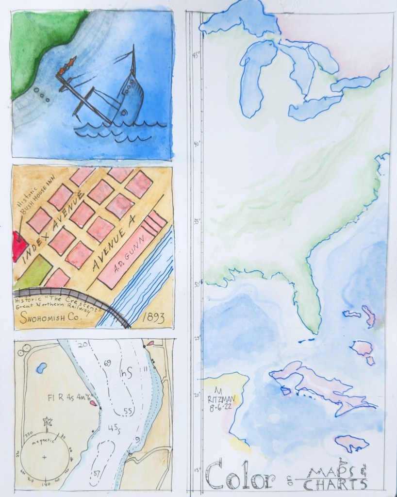
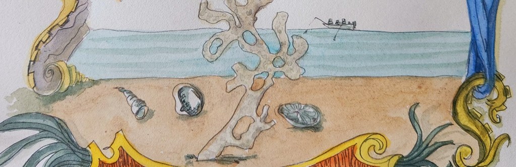
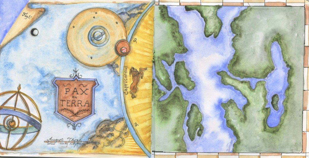
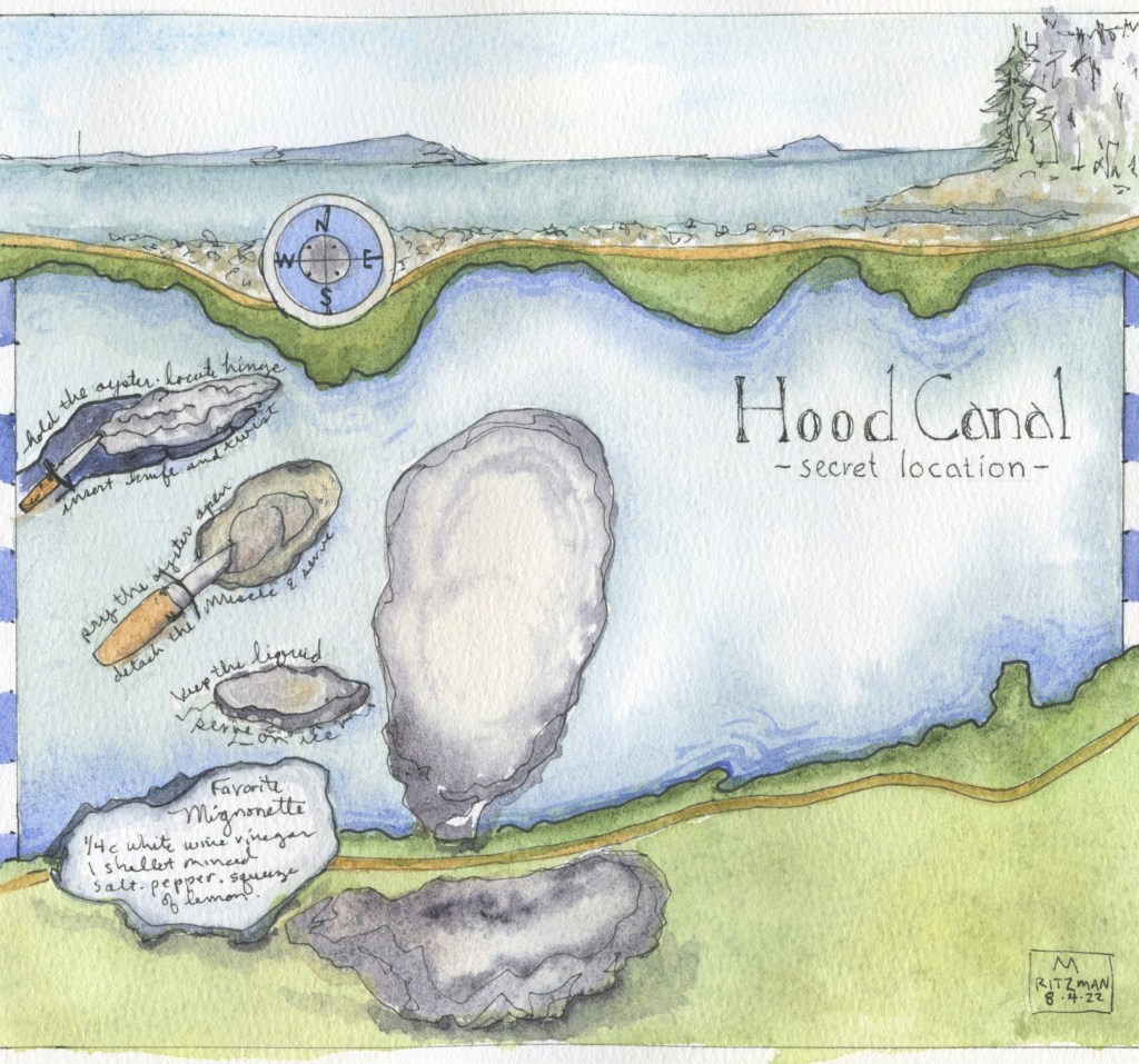
Many watercolor artists keep a nature journal or practice urban sketching. Recording with a sketch ‘ a sense of place’ often includes a map to tell the story. Creating a watercolor map can take a couple days as the area is researched and images are chosen. This month my personal challenge is to include an illustrated map of some type in each of my daily sketches! Here is a start…
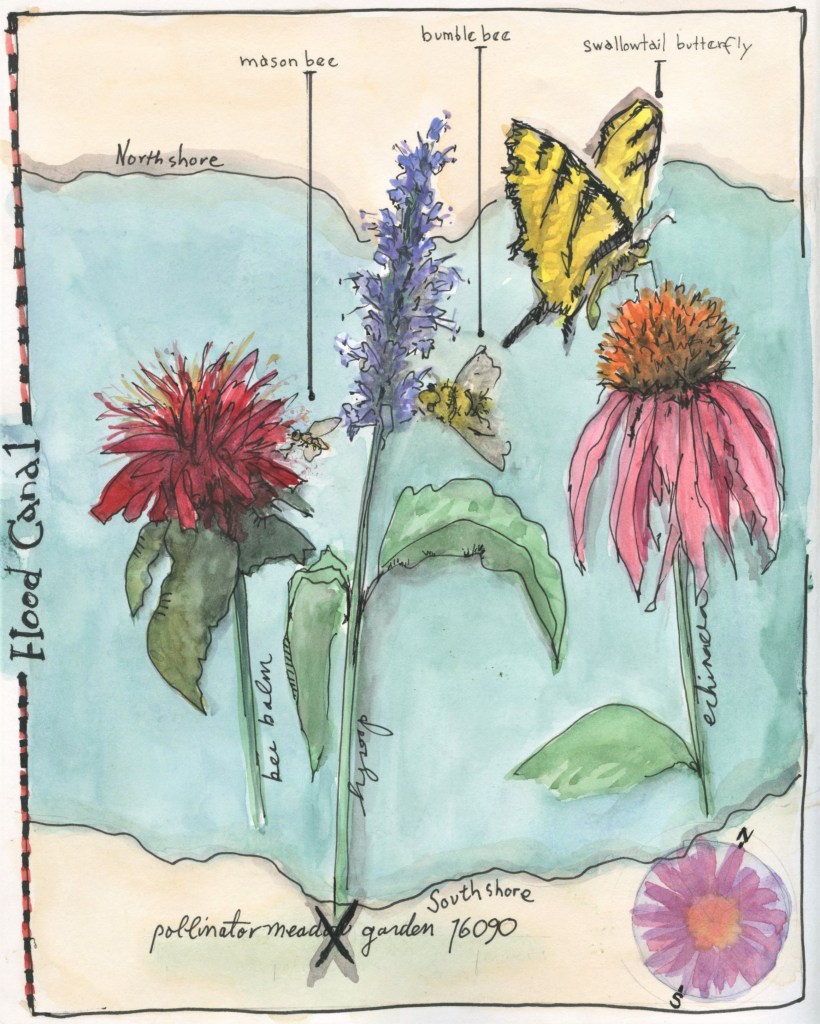
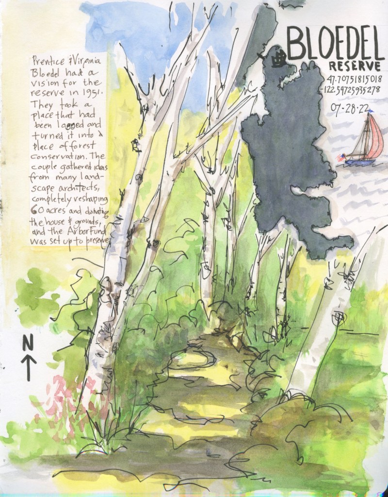
Nature journal artist John Muir Laws includes tips for making a map in his books. He suggests ‘ This will lead you to look at the geography of a place and it might reveal patterns you would otherwise overlook’.
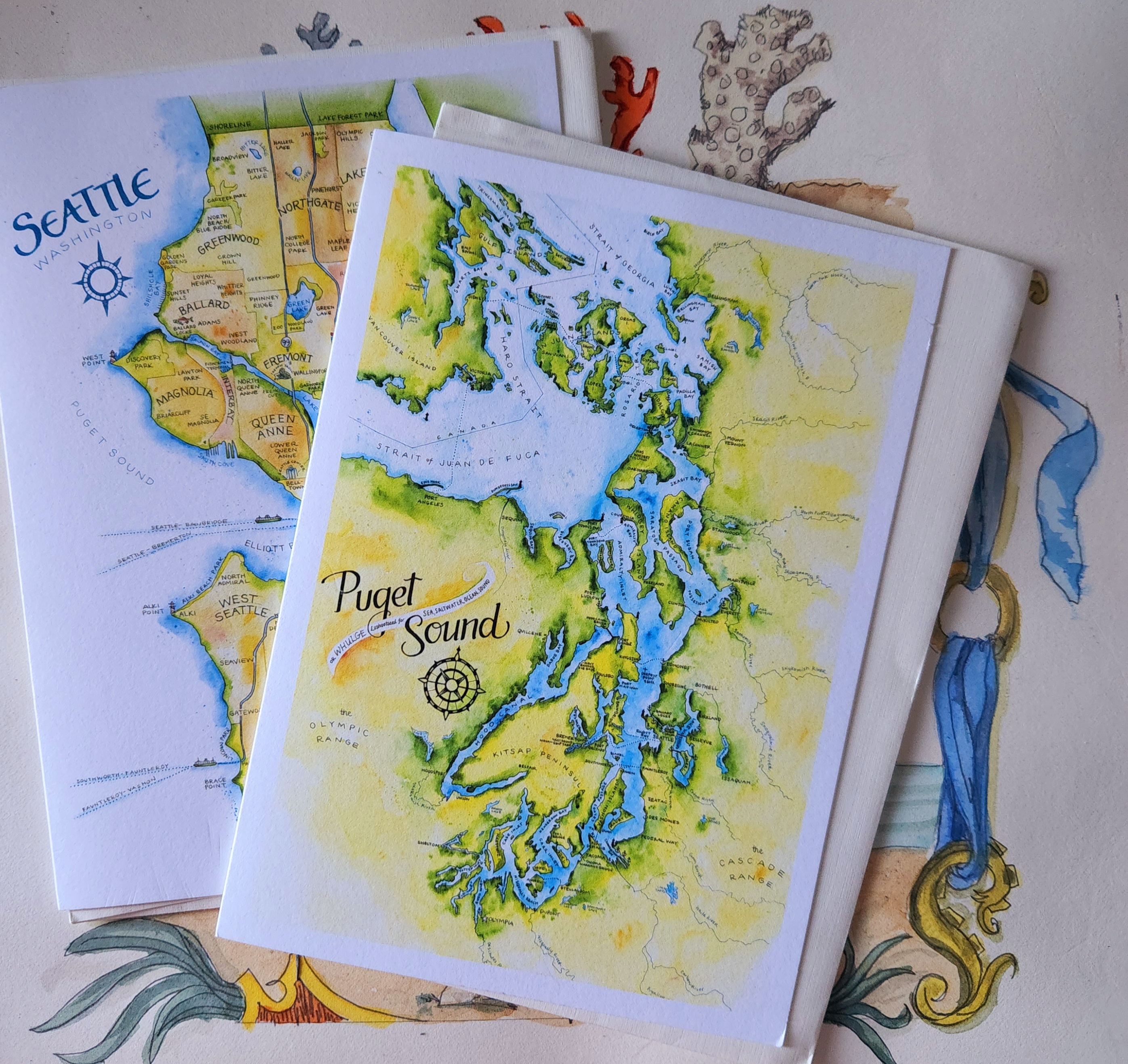
Check out local Washington state artist Elizabeth Person, she makes map art decor for anywhere in the world in a beautiful way http://www.elizabethperson.com

Leave a comment